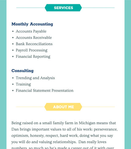
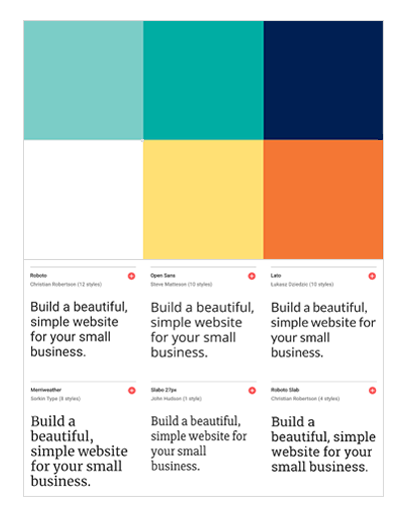
Create a simple color palette and use legible font.
The color palette and fonts for your accounting business website should relate to your company's look and feel. Start with a base color from your company brand. Incorporate neutral colors (white and dark gray) and then add an accent color. Once you have the essentials in place, you can introduce more colors if you'd like.
Avoid jarring colors that may make your text hard to read. Remember that you’ll have website visitors of all ages and abilities. Make it easy for them to read your content.
Your company's website should have no more than 2 different fonts.
This is to prevent your website from looking cluttered and less legible. A safe choice is to choose 1 serif font and 1 sans-serif font.
What's the difference between serif and sans-serif? Serifs, like Times New Roman, have the 'tails' at the end of letters. Sans-serifs, like Arial, don't.


