Build A Simple Landscaping Business Website
Onepager customer, Marcy Denker Landscape, is a US-based designer and consultant for sustainable landscapes. She makes excellent use of colors and images to create an engaging website.
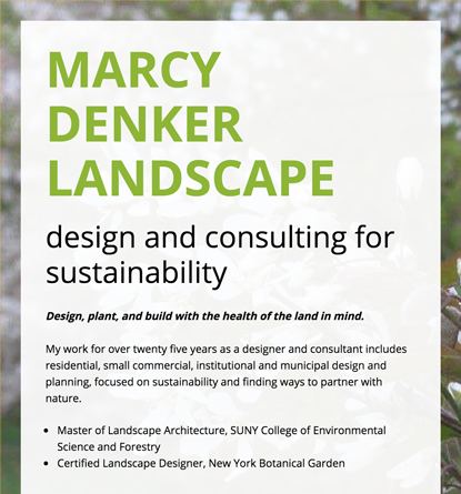
A great tagline tells visitors what your website and business is all about. Pair that with short and informative copy and you have a perfect header for a simple website.
Marcy Denker Landscape does a great job with creating an effective tagline. “Design, plant, and build with the health of the land in mind.” Her no-nonsense copy tells visitors what the business is all about: sustainable landscape consulting.
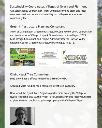
It's challenging to cover all the work you've done in your career without cluttering your website. That's why it's important to only choose your best and most relevant achievements. These highlighted projects build trust with potential customers.
Marcy Denker Landscape does this by using simple bullet points. Bullets are easy to read and effective. She also uses clear and concise headings to do something similar. "Sustainability Coordinator, Villages of Nyack and Piermont", and "Green Infrastructure Planning Consultant". These are examples of clear text for your landscaping website.
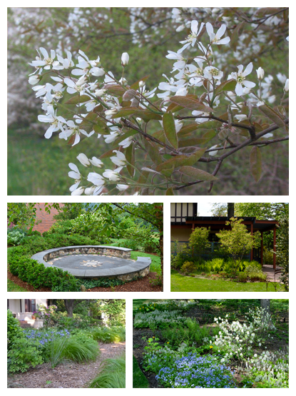
Pictures communicate more than words. What you can't express in plain text, show your audience with a great visual. These enhance your website design, get your message across, and keep visitors engaged.
Marcy Denker Landscape showcases her work using a beautiful image slideshow. A slideshow is an effective way to engage your audience. It encourages them to interact with your site and shows them how great your work is. They've also added a friendly head shot of Marcy. This humanizes the business and puts a face to the name.
Also, notice how she's used a green, nature-themed image in the background. She continues the use of a similar color scheme for their entire website. The colors are also represented with the font.
This is to prevent your website from looking cluttered and less legible. A safe choice is to choose 1 serif font and 1 sans-serif font.
What's the difference between serif and sans-serif? Serifs, like Times New Roman, have the 'tails' at the end of letters. Sans-serifs, like Arial, don't.
A great website is designed to convert visitors into paying customers. A great way to do that is to show your relevant contact information. Make it easy for people to reach out, ask questions, or hire you.
Marcy Denker Landscape does this by show all of their important contact information. This includes her phone number, email address, and location. Using Onepager's contact module, you can easily populate a clickable phone number on your website. Site visitors can effortlessly call your business as soon as they want.
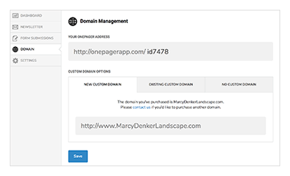
A short and simple domain name that's easy to type and remember is ideal for any business. Stick with a ".com" version of your domain. Avoid words with hyphens, multiple spellings, or numbers, just like marcydenkerlandscape.com.
Once you have your .com address, you can use it in a number of ways. Include it on your business cards and other print materials. Tell your friends and family. Use it on any social media profiles you have for your business.